Contact
Work
Roula KHAYAT
Contact
Work
Coffee Promo Video
Tools: After Effects, Illustrator, Photoshop
You may also like
2023
Digital Wedding Invitation – One Line
2025
Digital Wedding Invitation – Black & White
2026
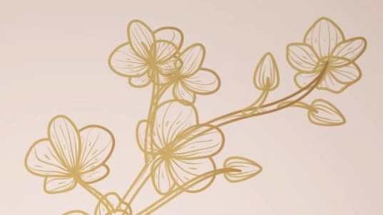
Digital Wedding Invitation – Floral Gold
↑
Back to Top